
Find out the ranking of various institutions based on MHRD's national institutional ranking framework.
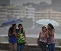
The monsoon has finally brought back smiles to the faces of people, especially farmers, of India.

The Credit Suisse Global Wealth Data Book 2014 published detailed data on wealth holdings of households around the world.

The Credit Suisse Global Wealth Data Book 2014 published detailed data on wealth holdings of households around the world.

The Planning Commission of India has released the official Gross State Domestic Product figures. The map above shows the GSDP of each state in the year 2013-14 in Rs crore.
The Planning Commission of India has released the official Gross State Domestic Product figures. The map above shows the GSDP of each state in the year 2013-14 in Rs crore.

'We expect the bull-market phase to still persist, but now led by large-caps which offer better valuation and benefit from FII inflows.'
'We expect continued pressure on midcaps, but any sharp correction looks unlikely from here on.'

The BJP which won only three seats in the last assembly election is looking confident to make inroads is Mamata's den.

A map showing the number of Indians lodged in jails around the world, based on information from the Ministry of External Affairs.
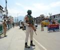
'Nobody can control Kashmir and what happens here.' 'Even a government with a full sweeping majority and strong mandate hasn't been able to control the state.'

Rajeev Chandrasekhar outlined his ideas to turn Thiruvananthapuram not only into a hub for higher education, but also a knowledge city, points out Ambassador T P Sreenivasan.

The 'Swachch Sarvekshan-2016' survey, released by the Urban Development ministry recently, ranked Indian cities on the parameters of cleanliness and sanitation.

Check out the 2012 cattle livestock census figures which show that cattle population in India has declined drastically.

'We first collected samples from all the bomb blast sites.' 'We had to find what was common among them.'

The per capita income of India has grown 209 per cent from Rs 17,736 to Rs 54,835 during the years 2001 to 2011. Explore the map to see where your state stands.

Check out the winners of the Sony World Photography Awards 2024. Now in its 17th year, the World Photography Organisation's awards ceremony is a major annual moment recognising the best photography in the world, celebrating the images and stories that have resonated with global audiences over the past year.

The J&K report card above that shows important metrics for the state.


A graphic showing how passenger traffic at Indian airports has grown over the years.
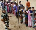
Move the pointer on the sentiment meter (depending on who you think will get more votes) towards the political parties to see how the outcome is likely to change.

The map above visualises the percentage of households that have access to drinking water within the premises as found in the National Sample Survey's 69th round (2012).
'Why should we disclose classified information to satisfy those who doubt our Hydrogen Bomb capability?'

The ratio of male to female divorcees varies widely across India.

This map shows the districts of India with their encroachment levels.

Take the rediff business quiz and see how much you know about India's pharmaceutical industry.

By incorporating creativity into academics using items you already have at home and encouraging exploration, you can make the learning journey not only enjoyable but also memorable.

The map below shows the classification of this score into Mostly Dirty, Somewhat Clean and Mostly Clean.

Click on the map to see the quantum of reservation across all our states.

Deepa Gahlot picks 10 Web series that was worth the viewer's while.

Move the slider on the map above to see the change in percentage of target achieved in collection of donated eyes over the years ranging from 2007-08 to 2014-15.

A map showing the 50 deadliest air crashes and the number of fatalities in the last five decades

A feeble fable masquerading as a robo rom-com, Teri Baaton Mein Aisa Uljha Jiya aspires to address what unrealistic expectations in a relationship can lead to, observes Sukanya Verma.

Yaatris works neither as a comedy nor as a family drama.

The map above shows the percentage of people around the world who tend to, on a regular basis, consume excessive food as compared to their personal energy requirement.

The infographic shows the total number of lives lost in India in natural disasters since 1990

Rediff Labs analysed the data on MPLADS to see how the money given to each constituency was spent.

The map shows the change in HIV deaths per 100,000 population over 2005, 2009 and 2013.

The map, above, shows us the number of road accidents per one lakh people, represented by the size of the circle and its severity (deaths per 100 road accidents).


rediffGURU Mayank Chandel offers advice to students interested in a careers in science or engineering after class 10 and 12.